
Susan Cummins- Did you name your gallery after the song Silver, Blue and Gold by Bad Company? How did you come by the name?
Karin Worden- Well, yes, but I rarely admit it! I spent the first year telling people it was because the jewelry shown was silver and gold with a little something extra – which is true. And the blue symbolizes the sky and the ocean, which is a big part of the Laguna Beach vibe.

I ended up putting the retail dream on hold to go to grad school. When life eventually turned back to the gallery, I wanted to honor the original idea by using the name. Also, (though I think it is really a break up song) the refrain is about the sky and rainbows. I truly feel this gallery, the opportunity to promote studio jewelry, and to further the careers of my contemporaries is my rainbow – what it’s all been for.
Tell me something about how you got involved in the decision to open a jewelry gallery? What is your training and educational background?
I started jewelry in a high school crafts class at age 14. Within days of picking up the torch, I was given keys to the studio, and my teachers looked the other way when I skipped classes to make jewelry. It’s been a passion since. I’ve honestly tried to do other things professionally, but I always felt I wasn’t where I was supposed to be, and I would think of jewelry and make jewelry on my days off.

Why did you choose to show studio jewelry rather than traditional commercial jewelry?
I’ve never been interested in commercial jewelry. I’m actually trying to cultivate more interest while I work on my gemology certificate and am exposed to more of the jewelry industry as a whole. Silver Blue & Gold does source tradition jewelry for our clients (we have accounts with the major suppliers) but it’s not our focus.
I am a studio jeweler myself, and the gallery grew out of my work. It’s hard to describe and it sounds almost superstitious, but when a piece is made with purpose and passion, it has an energy that sticks with it, lives on, and sometimes grows with the wearer. I just don’t find that in mass produced items. The quality even gets lost sometimes when a studio jeweler begins outsourcing and using a quantity-based business model. That’s part of why we focus on hand fabrication.
In looking at your website it appears that you show painting as well as jewelry. Is that correct? Do you use the same criteria to show both?

There is one prominent wall behind a section of jewelry cases. (The other walls are windows). The fine art is chosen to compliment the jewelry or relate to it thematically.
Currently, we’re featuring oils on wood of ocean waves by local painter and printmaker Sheryl Smith Seltzer. We first showed her oceanscapes in an exhibition titled “Summer Blues” that paired the oil paintings with a collection of aquamarine jewelry by Petra Class. The theme is a good fit, as we are on Pacific Coast Highway. If you were to turn the wall into a window and then push aside the hotel on the other side, you’d get the same view of waves.
We recently had a successful showing of wall sculptures by Andrea Haffner. She makes both jewelry and wall art from compositions of natural objects inlaid with colored resins. That the wall art was ‘craft’ helped it fit the gallery. People saw the wall art as an extension of the jewelry, rather than decoration. We exhibited a collection of Haffner’s jewelry at the same time, and it was well received, too.
Upcoming, we will pair photographs of Big Sur with jewelry inspired by the location. And in the works is a collaboration between myself and illustrator Suzanne Walsh. Her detailed pyrography drawings on wood panels will serve as a resting place for the jewelry when unworn. I look forward to puting jewelry on the walls!
How do you describe the jewelry you show?

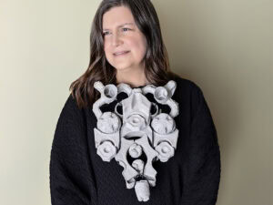
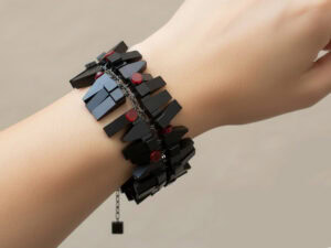
We use the term studio jewelry over art jewelry because, while we love conceptual work, we’ve chosen to focus on wearability. We have a few conceptual pieces in the cases, but for the most part, the jewelry is unique design that fits into everyday lifestyles.
The aesthetic is a bit like what you would find at American Craft Council shows. That is where I got my start, and I opened the gallery with artists I had met or admired there.
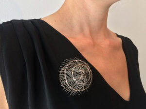
Since I had an existing clientele for my own designs in Laguna Beach, I opened with the statement, If you like my jewelry, then you’re going to love this! I wanted to turn my clientele on to the jewelry I saw when I was at the shows. A lot of that was blackened silver with gold accent. Somewhat of an urban feel. The gallery is cottage-like and sunny, though, and we are across the street from the Pacific ocean. So the location has begun to influence the collections and the black and gold now shares the space with a lot of bright gold and colorful gemstones.

Some of the artists we opened with are Natasha Wozniak, Davide Bigazzi, and Wesley Glebe. They represent the black-and-gold aesthetic. Artists we’ve added since include Petra Class, Constance Gildea, and Isabelle Posillico, each of whom brighten the cases with bright gold, colored stones and diamonds.
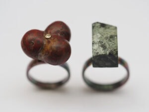
Our ring show has been such an opportunity to bring in a range of mediums and design. It’s wonderful to add so much diversity, while having it all fit seamlessly in with the permanent collection. Among others, Ring 4 Spring showcases the Mokume Gane of James Binion; beach stone, gold and glass jewelry by Andrea Williams; Funky fresh uses of gemstones by Ananda Khalsa, Yumi Ueno, and Sydney Lynch; Gem ceramic rings by Etienne Perret ; and sensuously subtle diamond and sapphire palladium engagement rings by Alexandra Hart.
Is your show Ring 4 Spring an annual event?

Why is there a mission statement on your website? Those are usually reserved for non-profits.
We want people to know what we are about – artists and visitors. The hardest part so far has been getting people to know we’re here to see what Silver Blue & Gold has to offer. When you do a fine craft show, you’re preaching to the choir, a preselected audience. It’s different with retail when you are interacting with the general public and competing with a lot of other messages, the chain stores, and the internet.
Also, it is a mission. I believe in the value of handcraft, and the truth is, it can’t survive without profit. The more I can match collectors with artists, or turn lookers into collectors, the more those artists can buy new materials, make new work and grow their craft.