
Susan Cummins: What inspired the theme of black with a color accent? Why not totally black?
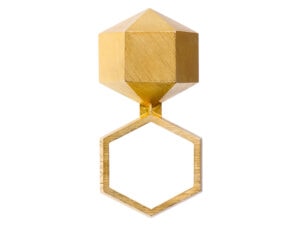
Michael Dale Bernard and Tara Locklear: All black jewelry is a three-word statement. The Monochrome Noir theme is not that simplistic. It is not about black. It is not about accents. It is about a symbiotic relationship of a bold color and a deep void of any color. The show began with three artists that Velvet da Vinci was interested in putting together. These makers had a certain affinity for a dark palette but were clearly not afraid of color. Yet, each of these artists had only a few pieces that successfully combined deep black fields with color in a way that provided an equal visual emphasis to both. This equality became the goal or stimulus for the show, and the idea was transposed onto the other artists’ established styles.

Michael Dale Bernard and Tara Locklear: Perhaps the comparison is too narrow. We are not particularly familiar with Estonian black, and we imagine that an Estonian jeweler may be equally perplexed with the question. The cultural interpretations and symbolic meanings of the color black are so dense that they would fall under the umbrella of complexity— something beyond complex.
Even within the context of North American makers, interpretations and inspirations could range from historical mourning jewelry to pseudo-sinister heavy metal or punk rock references. Each maker has a unique, individual sub-context within the overarching context of country or continent. The concept of black in Monochrome Noir is being filtered through the artful lens of 22 different makers.
There are many artists known for using black almost exclusively, such as Jorge Manilla, Agnes Larsson, and Kadri Malk, but their work is not in the show. How did you decide whom to invite?
Michael Dale Bernard and Tara Locklear: The show is not about black. The show is definitely not about artists using black exclusively. Monochrome Noir is a collection of artists that are truly, earnestly, and methodically pushing materials. These artists have simply been asked to use black. If you examine the artist statements forwarded by these makers, they do not speak of color much at all. Instead, they emphasize sourcing, combining, exploring, and controlling materials. Their concepts are being actualized through diverse tradesman skills into fine art objects.
The color palette of the show is a curatorial constraint. It is a creative obstruction or condition that has been set to provoke a response. We found each of these artists’ existing work to be wonderful as is. The constraint of black and a single hue provided the catalyst for all of these disparate practices to alloy into a single theme for the exhibition. Through the challenge of the show’s concept, we have all created work that contributes to a relevant snapshot of a niche of makers focused on process, materials, and technical finesse.
Beyond the work, we sought out artists that fit a particularly savvy profile. We believe in the moderate, cooperative, and collegial persona; the artist that can be so confident in their identity that they can explore outside their comfort zone and still make work that is quintessentially their own.

You are both jewelers. Have you ever curated before? What was the curatorial process? What did you learn in the process of curating this show?
Michael Dale Bernard and Tara Locklear: Neither of us would really identify ourselves as jewelers. This is not merely semantics but an important factor in considering the body of work chosen for the exhibition. We both have formal training but have taken more exploratory or academic paths. We are makers and understand the language of technique and craftsmanship and that is our point of entry.
This is our first curatorial effort, and we believe we approached it on our own terms in a way that is unapologetically artist-oriented. We learned that if you make the right choices early, you benefit from those decisions throughout. Our process was organic and from the gut. The artists were chosen primarily from our cipher; artists that are openly working alongside us from a distance. They are participants in a virtual flow of insight and creativity that is happening online. The ease of electronic communication and the abundance of visual content are generating an informal academy of feedback and dialog that was essential to the development of this show.
It is often the case that scholars research a field to organize an exhibit like Monochrome Noir. How do you think their approach differs from yours? What are your feelings about putting your own work into a show you curate?
Michael Dale Bernard and Tara Locklear: This exhibition draws from a narrowed field, but one that is defined through the eyes of two makers who participate within that field. Research played a role for us, but the greater deciding factor was personal interaction.

Our process made us more facilitators than curators. We were giving back to the field by taking the time to organize our voices into one statement. We brought makers and work together to produce a good collection of objects. We worked with them to collect images and ideas to produce a compelling catalog. We collected work early enough to organize and direct an editorial photo shoot that adds tone and material context to the artwork.
All 22 of us were in this together from the beginning. We did not dictate, and that is why we feel our participation is genuine. We do not present this exhibition to the field; we stand with and are a proud part of this group of artists. The traditional ideals of curatorial integrity through distance seem irrelevant to us in this instance.
Can you name one or two pieces in the show that you think were the most successful based on your concept of the theme?
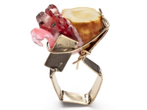
Michael Dale Bernard and Tara Locklear: The works of two artists stand out the most to us when we examine them or hold them up to the concept. Sarah Holden is forging and welding steel. Her adaptation of blacksmithing techniques develops the deep black of wrought iron. She then takes a tight, technical approach to color as she laces and knots vibrant pink hosiery through her structures. It is a weaving of strength and femininity, the rigidity of steel and the allure of stockings.
Katie Poterala is addressing the concept from a much more organic angle. Color seems to drip, bubble, and ooze forth from her familiar and iconic black forms. Her powder-coated surfaces have been worked to create a tension of hideous beauty that captures the viewer from a distance, yet upon close examination, evokes questions of mutation and the abject. The work feels uniquely biological and liquid compared to Holden’s, even when she is using the same black and pink palette.

How do you know each other, and can you tell the story of how this collaboration was born?
Michael Dale Bernard and Tara Locklear: We met in 2010 at the “Material Topics” symposium at East Carolina University in Greenville, North Carolina. Tara played a critical role in the ECU Metals Guild, financially coordinating many aspects of this fully student-organized symposium. Michael was an instructor from California State University, Long Beach. He was at the symposium to demonstrate powder coating and to give an artist lecture along with nine other makers.

Will the show travel? Is there a catalog? Where can it be found?
Michael Dale Bernard and Tara Locklear: The show is exclusive to Velvet da Vinci. There is a 136-page catalog produced by Michael. It documents more than 90 percent of the pieces in the show. Each artist submitted a statement tailored for the work in the exhibition. These appear in the index. Robert Ebendorf, the Carol Grotnes Belk distinguished professor at East Carolina University, wrote a critical essay that very knowledgably addresses material exploration. The catalog also contains a photo editorial of 24 beautiful models images captured by Becky Parker and visually directed by Tara. Twelve of these images are mounted and displayed in the gallery alongside the work, contributing to the overall visual context of the exhibition. The Monochrome Noir exhibition catalog is available from Velvet da Vinci.
Thank you.