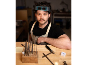
- The exciting KOHĀ and KOHĀ Moana happenings in Munich expanded the typical audience of Munich Jewellery Week
- Jewelry pieces present in both events were seen and experienced in very different ways by two audiences
- These alternative approaches to displaying jewelry brought the work to life in an energizing contrast to the expected—and conventional—modes of exhibition in Munich
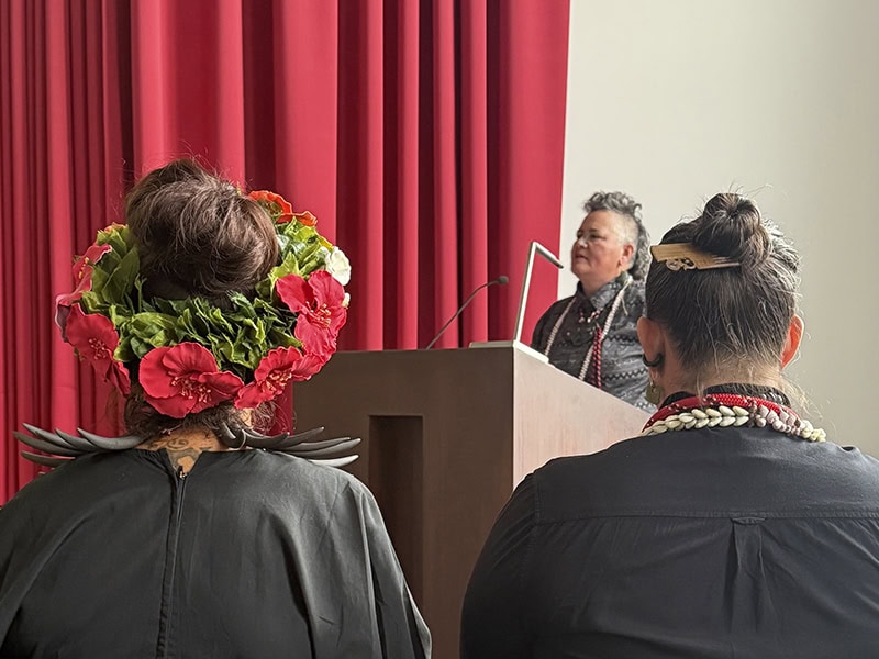
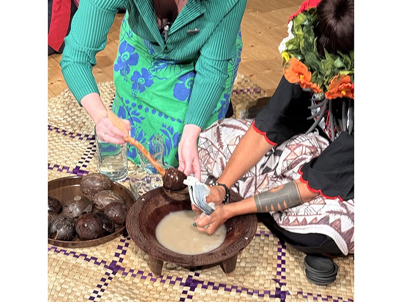
At the start of my Munich Jewellery Week adventure, I made my way to the Museum Fünf Kontinente (Museum Five Continents) to attend the KOHĀ ceremony led by Aotearoa (New Zealand) adornment practitioners Neke Moa, Sofia Tekela-Smith, and Stevei Houkāmau. The Munich Jewellery Week website described it as a performance and activation.
Koha is a vital concept in te ao Māori (the Māori world). It references the act of offering a gift or contribution as an expression of gratitude. Koha exists in both formal ceremony and everyday life.
Tungia Symonds-Kaihau (Tainui, Ngāti Maniapoto) introduced an idea around the notion of koha by adding a macron over the ‘a’ to emphasise the second syllable hā. This addition extends the understanding of kohā to be a celebration of life and relationships within it, as ‘hā’ means the breath or essence of life.
Within this activation, kohā is interpreted as a reciprocal exchange acknowledging the relationships between cultural adornment, their makers and their wearers.[1]
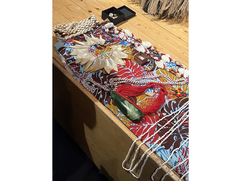
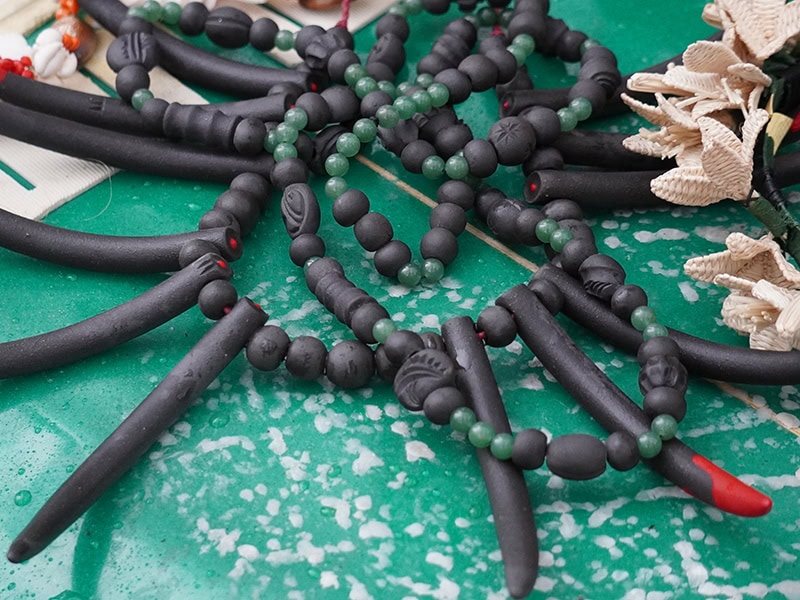
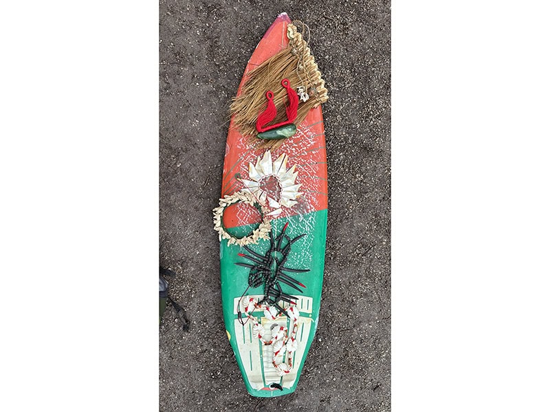
The happening was rich and layered with many components. I cannot properly do it justice. In a highly emotive moment, Moa, Tekela-Smith, and Houkāmau showed works they made in response to works in the museum’s collection. In a surprise move by the museum, during the ceremony they were allowed to handle pieces from the historic collection, even permitted to wear one of them.
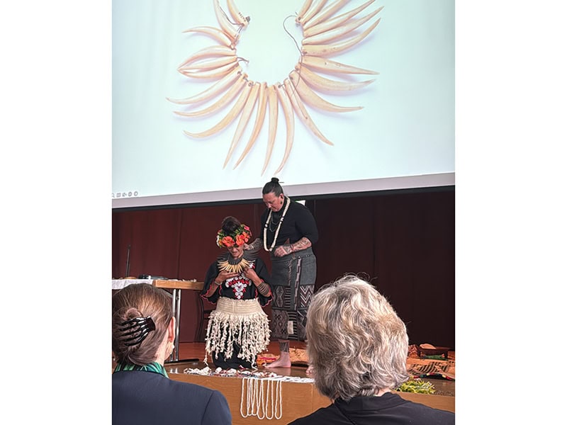
Dr. Hilke Thode-Arora, the museum’s deputy director and curator of the Oceania and Australia Department, told me about the process that took place months before the ceremony. The museum let Moa, Tekela-Smith, and Houkāmau view all the Polynesian collections digitally, then took high-resolution images of works that were of interest to the artists. Right before the kohā,[2] the three makers saw the taonga (treasures) in real life for the first time. Dr. Thode-Arora stated that the conservationist “had checked in advance whether there were any objects too fragile or possibly too toxic with insecticide treatments of the past (feathers!) to wear. After the artists had taken their choice, she prepared supportive strings for those pieces which the artists wanted to wear.”[3] What an almost unheard-of opportunity, let alone one initiated by the museum without being asked!
The engagement was moving. People attending the ceremony not only recognized the kinships between historical and contemporary objects, they grasped the impact of the historical works not just on Moa, Tekela-Smith, and Houkāmau’s work but on the makers themselves. Seeing and hearing about historic and contemporary works side by side, the audience physically understood the concepts in the historical works that were valuable to transfer into the contemporary work, not just the references to shape. The bodily and emotional reactions to this engagement left the room in attentive silence.
The audience was then invited to “engage in the process of kohā by exchanging and deepening an understanding of taonga and adornment practice through their own offerings of words, songs or small treasures.”[4] Attendees could offer objects, songs, or anything they wished as a way to connect with the three makers. In return, they received a material gesture, such as a necklace of small strung shells or a palm full of carved clay beads made by one of the artists, thus marking a moment of kinship and connection. It was a space to participate in what had been talked about during the presentation.
The surprise in the room over receiving physical works from the makers without an exchange of money or even physical material in return was palpable. It also created a way to take home something tangible to remember the engagement. It gave participants another entry into experiencing the discussion at hand. It emphasized the ability of objects to carry stories and histories and to remind us of our histories and connections to people not present.
Afterward, audience members were guided through the collection to hear what I would describe as an animation of historical objects. Moa, Tekela-Smith, and Houkāmau sang and spoke to the objects in the vitrines and told us stories and histories. This acknowledged the animism of the objects—the life, stories, and knowledge the materials hold behind the glass and trigger to those who listen to them. We saw that the object is not dead or a thing as it seemingly rests, contained by a vitrine. It challenged the audience to consider how we think about materials, objects, and the relationship of “the human” to them.
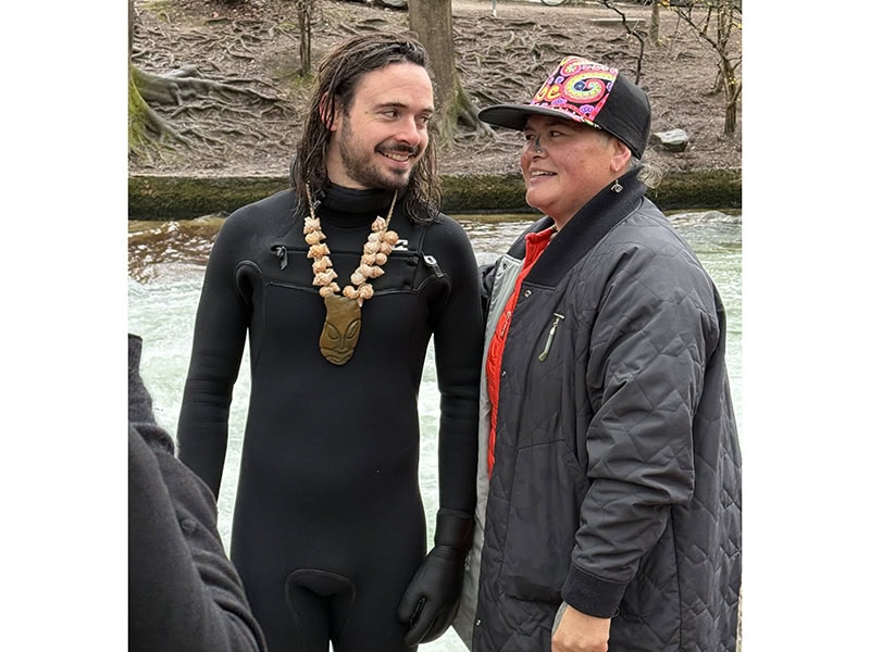
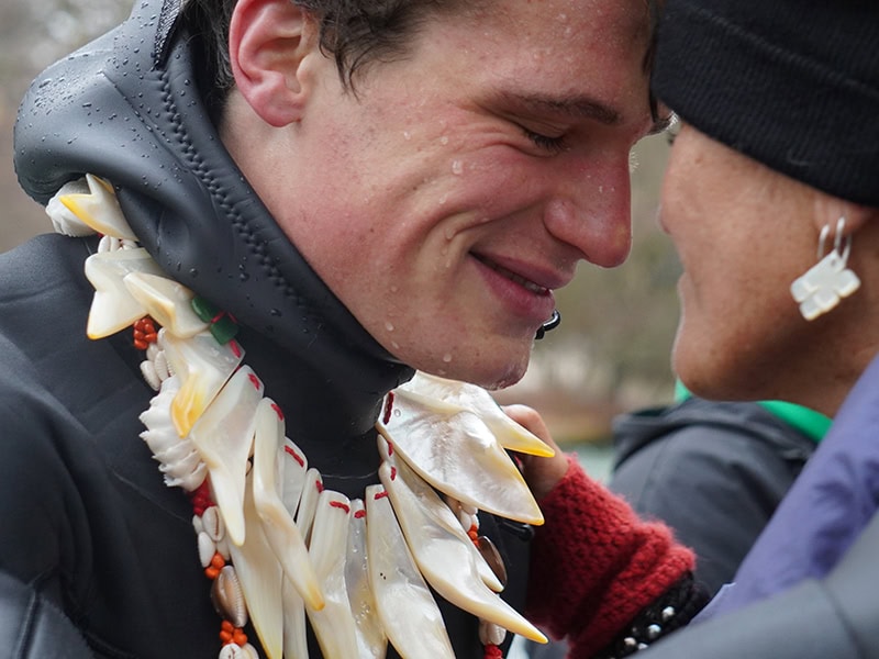
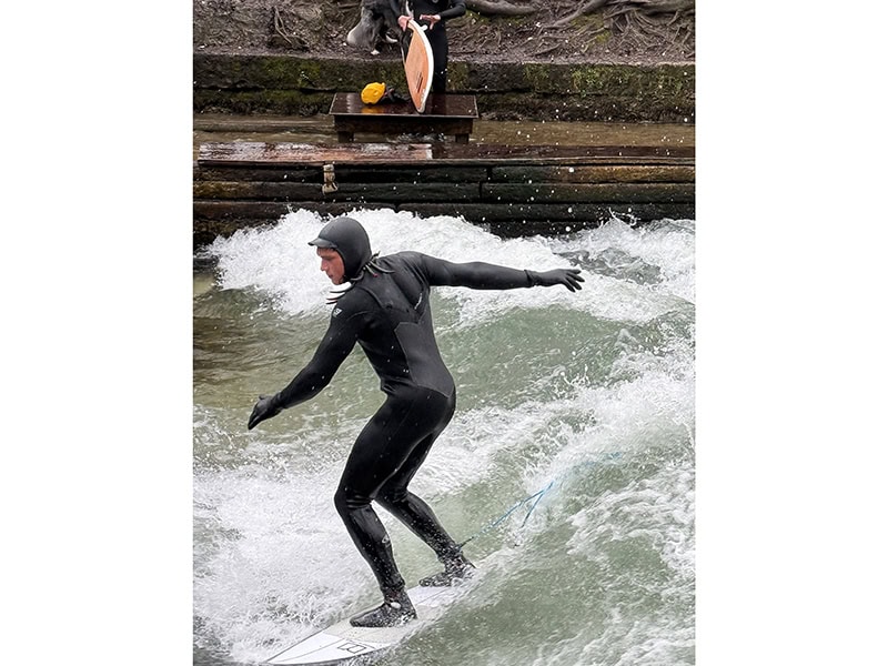
Moa, Tekela-Smith, and Houkāmau relate their practices “to aspects of the whenua (land) and moana (ocean).”[5] On the next day, they hosted KOHĀ Moana. This happening brought “the group’s taonga (treasures) back to the water to reconnect with this essential element.”[6] This was accomplished by working with a local surfer, Theo Bernier, who wore the work shown on the previous day while surfing the well-known wave on Munich’s Eisbach River. Wearing the work in the water served to replenish and reaffirm “the adornment’s connection to the natural world.”[7]
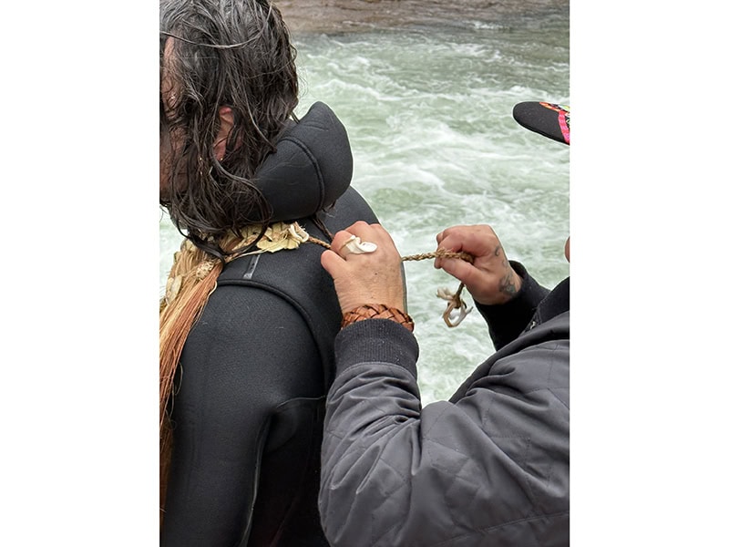
When asked about the origins of this idea, Moa told me that it stemmed from the collective. They come from a place that surfs, so it seemed logical to connect to Munich through its surf spot next to the Haus der Kunst—the center for contemporary arts just north of city center.
I admire how the embodied impulse seemed to always be at the front of decision-making among this group of makers. What may seem like random impulsivity or disorganization to some was actually an action of listening to the material, the land, and the bod(y/ies), and to do what felt necessary and logical from this perspective rather than formally logical in a Western exhibition sense.

This structuring allowed for engagement far different from the previous day in the museum. At the museum, participants had to deliberately enter a museum space and lecture hall, to have some sort of previous knowledge of what was happening, and to participate with intention. On this day, the three makers brought the exhibition to an unintentional public.

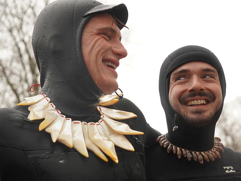
It is not every day one sees surfers adorned with objects one would not expect on the cold waters of Munich’s river. The relaxed event invited the public to ask questions or to stop and just watch. A curious surfer (I was only able to find out his first name, Leo) asked what was happening, and was suddenly surfing wearing a necklace by Houkāmau and posing for pictures adorned with a piece by Tekela-Smith. This open and fluid event expanded the typical audience of Munich Jewellery Week. People experienced different cultural thinking and different practices rather than just hearing about them.

Both events were rich, informative, and engaging. The same pieces were seen and experienced in very different ways. They provided a more robust understanding of the work, concepts, and terms Moa, Tekela-Smith, and Houkāmau were speaking of. I took in a larger perspective of the makers’ practices and how the objects they make are part of the work they are doing and not the entire work itself. Attendance took longer than visiting an exhibition, but it was time well-spent, providing a less-is-more, quality-over-quantity experience that I am still unpacking today.

Inevitably, in the conversations I’m in during Munich Jewellery Week, I hear some form of comment around how work is displayed, how it all starts to blend together and feels like a formula, or how the same display cases are used at the same places every year.
I agree, yet at the same time cannot lay blame or fault anyone’s lack of intention to do otherwise. Many artists travel from afar and are limited in what they can transport or afford on top of space rental, travel, and accommodations, all of which cost more every year. The uniformity of display mechanisms in institutions forces a viewer to keep their attention on what is in the vitrines instead of what is around them. This lends the works a form of equality in the cases, but also positions the object—and only the object—as “the work.”
I do not agree with the default choices made from the many possibilities available when it comes to display. The dominant story we often hear is of our shrinking field, heading for its deathbed. No wonder, when I see far too few efforts to engage with other audiences as jewelry works are tethered to a single format of exposure for the week. On a pessimistic day, it feels to me as if the field wants to sing its own swan song rather than risk failure by engaging in radical experimentation. But then comes a glimmer of excitement when I encounter something unexpected.
I do not promote this experience as a definitive model. There is not one right or wrong way to show and talk about work during Munich Jewellery Week. But this experience gave me a greater appreciation for the more traditional exhibition of static work. The variety of energies held my attention, let me focus on the choices made in presenting work. The variety prevented everything from blurring together.
The KOHĀ events are just one example of an alternative approach to displaying work during the week. Their format furthered the conceptual aspects of the work. I felt privileged to get further insight into Moa, Tekela-Smith, and Houkāmau’s practices. And what a joy to see how the different publics of Munich responded! But it was not the objects themselves that made this impression. The generosity of the makers and the people who warmly answered questions and invited others to participate allowed the work to be felt and not just seen. This essay does not do all of these actions complete justice, but it is the koha I give in gratitude to them.
We welcome your comments on our publishing, and will publish letters that engage with our articles in a thoughtful and polite manner. Please submit letters to the editor electronically; do so here. The page on which we publish Letters to the Editor is here.
© 2025 Art Jewelry Forum. All rights reserved. Content may not be reproduced in whole or in part without permission. For reprint permission, contact info (at) artjewelryforum (dot) org
[1] “KOHĀ Ceremony: Activation, Performance,” Munich Jewellery Week, 2025, https://munichjewelleryweek.com/events/5383.
[2] Zoe Black, of Objectspace, an art gallery in Auckland, notes that a kohā ceremony is not something traditional in the Māori world—rather that koha is offered at different times. This format was formulated specifically for MJW and the context of the museum. Zoe Black in an email to matt lambert, May 7, 2025.
[3] Dr. Hilke Thode-Arora to matt lambert, RE: Munich Question, 2025.
[4] “KOHĀ Moana: Activation, Performance,” Munich Jewellery Week, 2025, https://munichjewelleryweek.com/events/koha-moana.
[5] Ibid.
[6] Ibid.
[7] Ibid.