
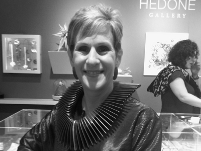
Bonnie Levine: For its current exhibition, Studio Fusion chose the theme Blue and Black. How did you come up with this idea, and what’s behind it?
Joan MacKarell: In 1996, six enamellists opened the gallery with a focus on presenting enamel work to a wider audience. Although we now represent a much more diverse selection of work from artists who explore multiple disciplines, materials, and techniques, at our core we continue to maintain a strong emphasis on color.
Seven of us now run the gallery and we continuously try to find new and exciting jewelry and metalwork. We have frequently noticed that the jewelry we find the most interesting often includes the colors blue and black. When planning our exhibition program for 2015 we chose this theme to show during February and March, as we thought it would present a strong and striking antidote to the dark months of mid-winter.
It’s said that blue signifies harmony, faithfulness, and confidence, and black represents understated elegance and sophistication. But the combination of “black and blue” refers to the color of bruises and the result of some kind of violence to the body. Did you start noticing a lot of black and blue jewelry or did you go out looking for it?

Joan MacKarell: Knowing that the words “black and blue” together can be associated with sinister connections, we purposely reversed the colors in the title of the show to Blue and Black to evoke the positive concept of the colors. Also (as stated in our exhibition foreword), we learned that over 50% of both men and women choose blue as their favorite color. The combination of black, with different textures from gloss to matte, and the myriad shades of blue highlights and emphasizes the sophistication of both colors.
There must be a lot of jewelers who use black or blue or both in their jewelry. How did you choose artists for this show?
Joan MacKarell: When selecting artists for this exhibition, we aimed to create an interesting juxtaposition, choosing the work of designers who showed a contemporary and innovative approach to different materials and techniques.
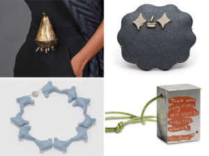
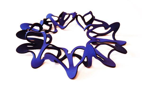
We were attracted to the way that Dario Scapitta and Lynne MacLachlan use 3D printing techniques to make bold sculptural pieces, as does Jelka Quintelier with her body pieces in laser-cut neoprene. Arturo Borrego has an industrial background and uses these processes successfully in his colorful wood and plastic pieces. We chose recent graduate Morna Darling for her playful approach to designing textile-inspired mixed-media brooches, while the three enamellists Jessica Turrell, Stacey Bentley, and Scarlett Cohen-French all adopt interesting approaches to enameling to produce highly individual and wearable jewelry.
Stacey, how did you become interested in making jewelry?
Stacey Bentley: In high school I was really interested in oil painting and when I enrolled at Leeds College of Art in an art foundation course, my aim was to become a painter and undertake a fine arts degree. After six months in the foundation program, I became particularly interested in 3D design, woodwork, metal work, and 3D drawing. I also enjoyed making objects that had a function and a specific purpose, rather than making objects for decoration or aesthetics. My tutor suggested that I do some research into jewelry designers, which I’ll admit never crossed my mind. I didn’t even realize you could pursue a degree in jewelry and silversmithing! But from that moment, I knew what I wanted to do as a career. To be honest, I thought it sounded cool to be a jewelry designer.
, 2014, oxidized silver, iron, enamel, 18-karat gold, stainless steel pin, 10 x 50 x 50 mm, photo: artist")
You’ve said that your approach to design is experimental. What do you mean by that?
Stacey Bentley: I’m not the type of person who would be happy sitting in my studio repeating the same piece of jewelry over and over again. That’s what I love about enamel. It can be so unpredictable and I have learned to embrace this quality of the material. I aim to discover something different each time I fire, and never try to repeat myself, as it never turns out as interesting and exciting as the original.
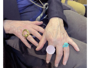
The focus of your jewelry is enamel work. Your jewelry is bold and colorful. What’s the significance of color in your work? Are you partial to blue and black?
Stacey Bentley: The reason for using enamel in my work is first and foremost all about the color. I love rich reds, bright yellows, and exotic lapis blues so, yes, I am partial to using blues in my work. The main reason for using this range of color is that these are shades that I mostly enjoy wearing. I love to use industrial enamels, as the finish is bold and bright and when I matte back the shine, I love the flat, plain surface that is created.
Jessica, tell us about your background as a maker.
Jessica Turrell: As a child I visited many of the jewelry exhibitions held at the Arnolfini in my home city of Bristol, and this early exposure to the work of some of Europe’s most interesting contemporary jewelers certainly fuelled my desire to become a jeweler. I later studied jewelry at Central Saint Martins, and in 2007 I gained an MA in multidisciplinary printmaking from the University of the West of England, Bristol. At Central I learned the skills associated with traditional enameling, but over time my practice has evolved to concentrate on more experimental and expressive techniques.

Like Stacey, you also work in enamel, but using approaches that you’ve developed over many years. Can you explain more about your techniques? What do you try to achieve that’s unique to your work?
Jessica Turrell: Much of my work is concerned with repetition, the delicate surfaces created by the application of many hundreds of hand-drawn resist marks prior to etching. I’m interested in how, subconsciously, I am compelled to subvert the tyranny of this repetition, introducing subtle variations as I draw. Once the etched surface is created, I apply the enamel in such a way as to produce a surface that doesn’t appear glassy, but instead is reminiscent of a tactile drawing on paper.

Jessica Turrell: Despite the title, the Field and Winter series isn’t inspired by nature. I don’t work directly from any visual reference but allow the work to evolve over time through an exploration of “found” shapes, direct mark making, and the visual characteristics of my particular enameling process.
I have to ask you about “blue and black”—do they have a special meaning for you or your work?
Jessica Turrell: No, not specifically. But I find that where color is used, it dominates, so in order to foreground the surface and form of the pieces, I tend to work with black and white. It’s a particular quality of the specific black and white enamels that I use that when they are layered up, they appear blue rather than gray.
Thank you.

